Michele Everheart

— PROJECT NAME

Crunchyroll Rebrand


— SKILLS

Art Direction

Visual Storytelling

Project Management

Graphic Design

Layout and Typography


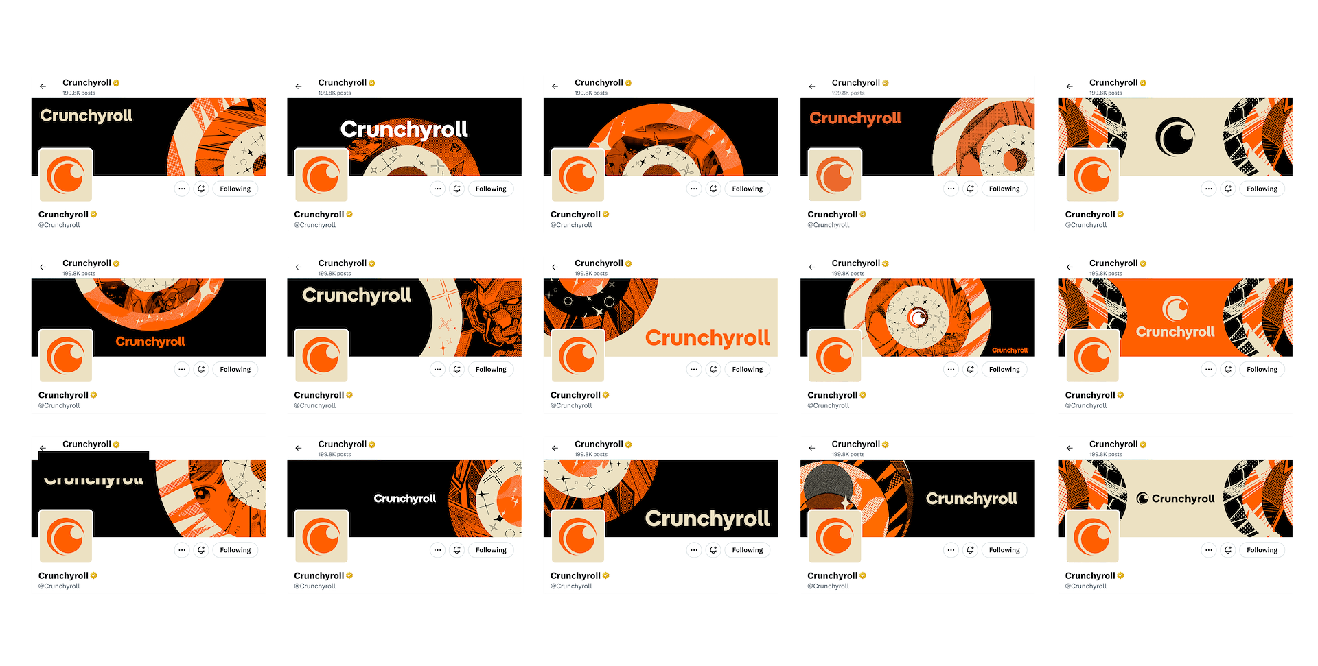
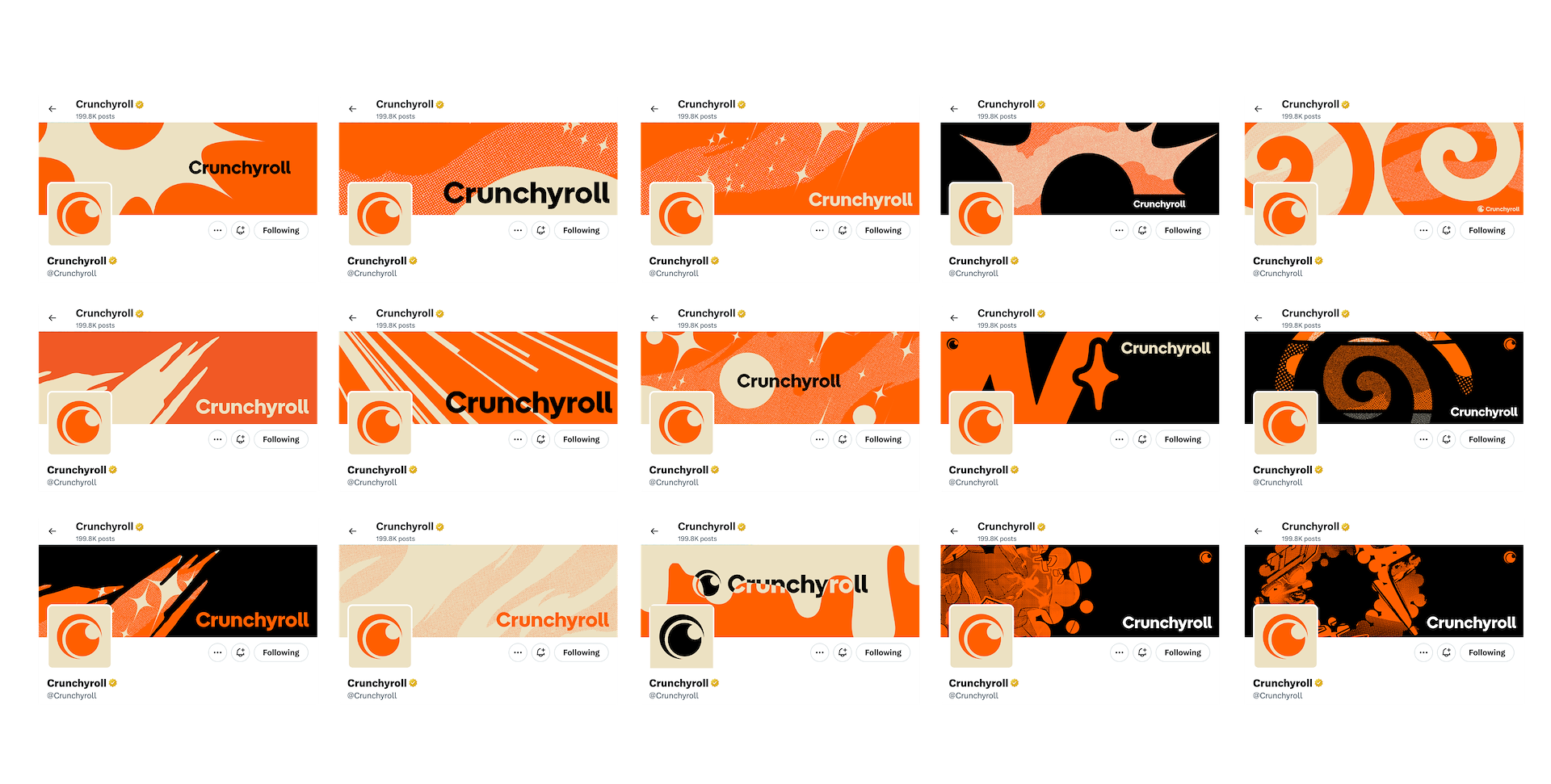
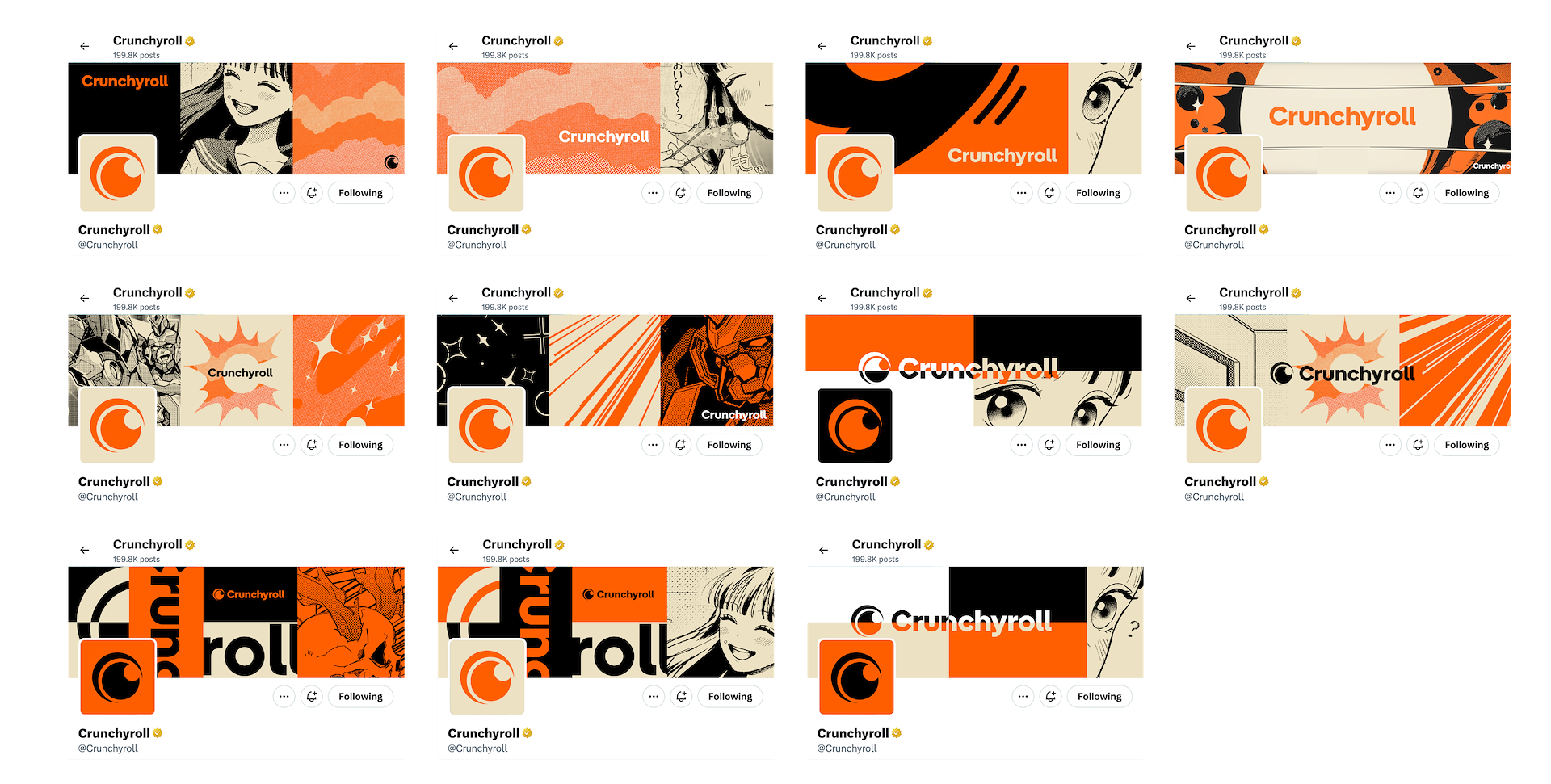
In July 2024, Crunchyroll unveiled a complete rebrand at San Diego Comic-Con. The new styleguide featured an updated logo, tweaked color palette, sleeker typeface, and more. I was brought on to the Crunchyroll Creative Services team as Associate Art Director to help guide this huge undertaking and evolve the brand using those new building blocks. At launch, only a few items had been designed out, like large-scale convention walls, but the smaller pieces still needed guidance. What would lockups look like, or CTAs, or even social media templates? How do we ensure the new styleguide is being utilized in intentional ways that stayed true to brand voice? It took many months past launch to polish those details across the entire brand's flywheel, but it's been an absolute privilege to help guide this giant black and orange Crunchyroll ship.

Lockups


The Crunchyroll lockup system was an extreme exercise in finding a solution for many different problems. Exclusive marketing verbiage wouldn't allow a clean design solution with the "slash", but it was often requested to include, so we workshopped a main "slash" option (with shortened bug when space is limited), and also a secondary alt version when text had to flow like a sentence, keeping it to the left side. This system was rolled out for many different marketing text – Streaming Now, Watch Subbed, Streaming [date] etc – and also had to function correctly translated into 14 different languages.


The CTA I developed had to function similarly, solving for many different alphabets, accents, and text restrictions.

CTA system. Developed as an editable template.

Brand Storytelling


The way in which Crunchyroll branding was executed changed with time as we realized after launch that some of the original design plans grew stale. Instead of big swaths of texture and grid-like layouts, we leaned more towards glyphs and organic shapes. One of the first exercises where we discovered the blocks weren't working was in our social media presence. I led the charge in finding an intentional solution for how general Crunchyroll social media banners would display – and landed on the "rings" design, which was inspired by the brand's new mnemonic video, where a drip creates ripples that expand out, representing the different areas of the company's flywheel.


Scroll for more >

Taking the brand into the future


Below are a handful of applications of how this styleguide has been applied following its launch, including physical print, OOH, digital, and internal collateral. As of now, I'm still striving to evolve the brand and keep it fresh for our audiences.

Physical giftcards

Muti-IP OOH billboards – India Campaign

Digital 3rd-party partnership placements

Generic brand print advertising

Internal business cards